Data Visualization: How to Make Sense of Big Data
The big challenge of big data? Making sense of overwhelmingly large data sets in a way that's not overwhelming. As more data is sourced and analyzed, mostly from the cloud, discovering the big insight can seem like looking for a grain of gold on the seabed. How do you dive deep into an ocean of data without drowning?
What is data visualization?
Data visualization is the process of graphically illustrating data sets to discover hidden patterns, trends, and relationships in order to develop key insights. Data visualization uses data points as a basis for the creation of graphs, charts, plots, and other images.
The importance of data visualization
Data visualization capitalizes on the power of big data and the cloud to deliver instant insights on what matters most to decision makers. Data drives business decisions, but data must become business intelligence before you can act on it. Data visualization is one of the most powerful ways to gain knowledge from data and clearly communicate it to others.
Images tell a story instantly and help create a narrative around the data to aid in understanding and using the data.
Examples of effective data visualization
Data visualization is the art of illustrating complex correlations clearly. The Forrester Wave is a familiar example to most B2B buyers.
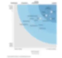
The Forrester Wave is an unbiased comparison of B2B vendors. In one image, it plots each company in relation to the strength of their current product offerings and the strength of their product strategy. The market presence of each company is shown by the size of the plots on the graph. In one glance, buyers can see who the big players are and how they rank.
The U.S Census Bureau has also developed visualizations to help understand census data. This example divides the United States into four areas and shows the relative population density in each area.

How data visualization works
Data visualization works best in a self-service environment where the data architecture is configured to deliver data to decision makers.
Traditionally, self-service meant generating reports from several internal and external data platforms and systems, combining the data into a spreadsheet, and slicing and dicing it for insights. In a modern self-service environment, data architects design pipelines to move data into a visualization platform, automating manual work and allowing analysts access to more sources of data. In this environment, analysts can source and combine data quickly for fast analysis.
For example, if you're processing a huge amount of data, you can quickly see the strength of relationships between variables using a correlation matrix. In this way, you can discover fascinating insights that may not be obvious when analyzing data in a spreadsheet.
Before drilling down into new insights, it's important to ensure that what is already known about the data is accurately reflected in the visualization. Data analysts generally have a good understanding of their data and will see obvious signals. If these signals aren't present, the data sources may not be delivering the full picture. In this case it's time to circle back to the data architect to ensure the right data is coming from the right places.
Four Benefits of data visualization
With accurate data in hand, it's possible to reap the benefits of analyzing data visually:
1. Data visualization improves insights
Data visualization simplifies the data analytics process by transforming massive amounts of data into clear visuals that are more meaningful to decision makers than lines of text and numbers. As data is correlated in a visualization tool, hidden insights and knowledge can surface to help inform the decision-making process. A single graph can clearly illustrate complex data sets to reveal hidden relationships, patterns, and trends, and to identify anomalies and outliers.
2. Data visualization accelerates decisions
Data visualization accelerates the analytics process. Businesses have a need for speed, because faster decisions lead to faster results. Businesses with an edge in data analytics can outpace their competition. The faster you can make sense of your data, the faster you can act on it.
3. Data visualization turns data into a narrative
Computers are great for processing large amounts of data, but the human mind is not. The brain processes an image faster than lines of colorless, look-alike data. We love colors and patterns because they tell a story.
Visuals tell a story, and stories are easy to understand and remember. By presenting data as a narrative, your audience — whether it’s the C-suite or your prospective buyers — will understand it faster and be more likely to keep it top of mind.
4. Data visualization boosts your career
Businesses are pining for insights from their data. Nearly every industry uses data to make decisions. Emerging big data tools are moving data analysis out of IT and onto the desks of business professionals. Skill sets for data-driven businesses are evolving and the ability to make sense of data will become more valuable. Anyone who can develop the skill and art of visualizing data will have an honored seat at the table.
History of data visualization
Data visualization has a long history, stretching back to ancient Egypt. In around 1160 BC, a map was prepared for Ramses IV to show locations of quarries, mines, and other natural resources in a 15-kilometer stretch of land in his domain. Probably the first known example of data visualization, the Turin Papyrus Map is augmented with annotations showing the size of blocks cut from the quarry, the distribution of various rock types, shown in black and pink, and the diversity of local gravel, shown with brown, green, and white dots.

Florence Nightingale, the creator of modern nursing, was also a data analyst. In the Crimean War of the 1850s, high soldier mortality was assumed to be due to combat, but Nightingale collected data to show that most deaths were caused by poor hospital practices. To drive the point home, she created a visualization.

Another famous historical visualization is Napoleon's March Map. In his campaign to capture Moscow, he started at the Russia-Poland border with 470,000 soldiers and returned with 10,000. The march to Moscow is represented by a thick red line that narrows to illustrate the loss of troops on the way to Moscow. A similar black line, also narrowing, shows the loss of soldiers on the march back to Poland. Under the map, a line graph shows temperatures on the march back, correlating the frigid winter temperatures to specific points in the march. As temperatures dropped, apparently so did the soldiers.

The cloud and data visualization
The cloud exists to handle the demands of big data. As more data and business intelligence solutions move to the cloud, it makes sense to visualize the data there. Data integration is faster and easier in the cloud and vendors are adding more power to the cloud-based versions of their visualization tools than their on-premises versions.
Large-scale self-service analysis and visualization is possible because of the cloud. It's the only practical platform for sourcing and analyzing real-time data, and it provides a central repository, helping to eliminate copies of the same data in different places. Keeping everything in one place helps companies with multiple locations access the same data at all times.
Much of the new data available for visualization is unstructured and requires massive amounts of storage to organize and archive it. Cloud storage can be purchased at a fraction of the cost of buying on-premises hardware and the expertise to maintain it, and allows companies to quickly and easily scale up to meet their data storage needs.
Data visualization tools: what to look for
Data is visualized by feeding data into a visualization tool. Generally, you can select the type of graphic to view the data, or in more sophisticated tools, algorithms automatically render the data in the best format. Many tools allow both options.
Tools range in complexity, features, and cost. If the goal is self-service analysis and visualization, be sure to explore cloud-native options. It's best to do your own research to ensure that the tool you select meets your needs. There are some key aspects to consider when evaluating tools:
Is there a customizable dashboard?
The heart of a data visualization tool is the dashboard. Customizing the dashboard should be simple and intuitive, and allow users with different perspectives to view data on a level that meets their needs. For example, C-suite users need a high-level view while departmental analysts need to drill down into specific areas.
Look for drag-and-drop interfaces that make it quick and easy to add and delete data as you dig for insights and test different visualizations.
Can the tool provide interactive reports?
Reports are a common way to share information, and the ability to quickly create new report formats with different data sets and visualizations will make your reporting stand out. The best tools allow you to instantly add or delete information to craft a report that really sings.
Is location data available?
If geographic locations are important to your business, location intelligence should be built into your visualization tool. The best tools offer powerful ways to compare internal sales, operations, and general business data with location-specific contexts like economic climate, cost of living, education levels, and other factors.
Can you access the tool on a mobile device?
Decision makers are on the go, and having access to business intelligence on a tablet, smartphone, or other device may be crucial. Look into mobile functionality to ensure it meets your needs.
Is there real-time access?
Accessing and analyzing data in real time is a must for many businesses. If you use real-time data, look for cloud-based tools that can process it.
Big data and data visualization
Organizations analyze data to find insights, and data visualization is a powerful tool to quickly discover and communicate hidden patterns, trends, and relationships from large amounts of data. In a modern data environment, data visualization is the fastest way to dig for hidden knowledge.
In the technology stack, data visualization is layered above a data warehouse or data lake. Fast, insightful data visualization works best when paired with a data architecture that supports it. Talend Data Fabric gives everyone in the organization the power to quickly prepare data for trusted insights. Get your free trial today to see how machine learning and governed self-access can put massive data sets to work for your data scientists, sales and marketing teams, and business analysts.

More related articles
- Business Analytics vs. Data Analytics: Which is Better for Your Business?
- Business Analytics - The Gateway to Informed Decisions
- Edge Analytics – The Pros and Cons of Immediate, Local Insight
- Predictive Analytics 101: A Beginner’s Guide
- Uniting Business Intelligence with Data Analytics for Data-Driven Insights
- What is Prescriptive Analytics?
- What is Data Analytics?
- Real-Time Analytics: Definitions, Details, and Tools